A2 Media Studies
Wednesday, 17 December 2014
Music Video Rough Cut
This is my rough cut of my music video. The bank shots are going to b e the narrative with my actors. I need to redo some of my artists shots and get some more close ups. I also need to make sure that the timing and placement of the shoot is sorted out.
Wednesday, 10 December 2014
Filming
 On the weekend, me and my artist filmed. I thought that because my genre is rnb i decided to film her against a brick wall so she can walk down and sing. conventional locations are extravagant but i chose to go against the convention and kept it quite simple. As it was cold, my artist was struggling to say the words and act properly.
 This was my second filming day of my two actors in the scene where they are developing their relationship hanging out and spending time with each other.
This was my third day of filming where the boy has seen the girl for the first time and gets her number. This is normally the start of every relationship.
This last day was where they are in a relationship and they are playing basketball together near the end of my music video.
Friday, 5 December 2014
First Attempt to Film
This was my first attempt to film my music video. It didn't go well as it got dark really quick around 2:45pm. This is part of my music video where the girl actor is going in her house. There were more shots to be done that day but i thought that there would be no point to do it as it wouldn't look good dark as it would light.
Tuesday, 2 December 2014
Feedback Digipak Pitch
Theses three feedback sheets are what some of the people in my class commented about how my digipak looks so far:
The main critiscism for my Digipak is that my images do not flow and that they are different in every shot. I am planning to re-do all of my shots and make sure that they make sense and that they are linked. I am planning to re-shoot her in a studio where there is black background first and then in photoshop i might be able to change the place to another colour which i would like to be purple as that is the colour i wanted my theme to be. I also need to make sure that i include text onto my Digipak
I also may change the layout of my Digipak panels and instead of two CD panels, i will have one so that i can add another image to a panel.
Friday, 28 November 2014
Logo Research
I have noticed that RnB artists do not really have proper logos. But what they do have is consistency. Their artist name has always been the same but nowadays more developed but surely still the same. Here are some examples:
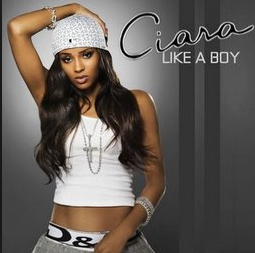
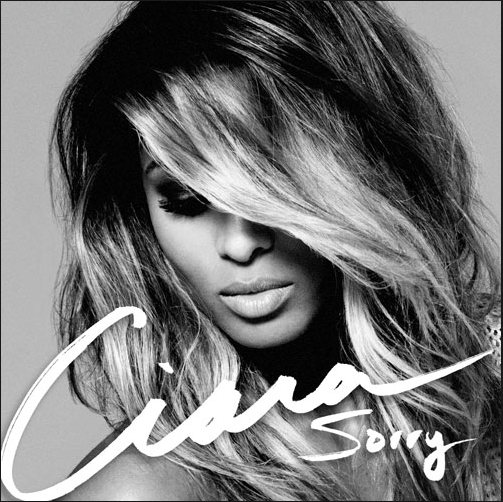
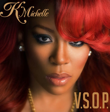
I want my font to be like these artists, the writing looks personalised to their style like i want mine to be. I need to make sure my font is up to date with modern society as the albums on the left are past albums and the ones on the right are recent.
So my font will be my logo.
What i did was, i went on a font website and i found a font called Bizarre which looks like Rihanna's font that she consistently uses. I decided that i could put my artists initials on top of each other to give a logo that is small recognisable and different. I also experimented with my original font Madamoiselle Camille which is a swirly skinny font which looks sophisticatedly soft.
These are my ideas that i have come up with. I may experiment with both fonts and see which one come out better.
Shooting Schedule
This is my shooting schedule which i will conduct my filming of my music video. I also put in the Digipak shoot that i have to do and possible re-shoots.
The first day of my schedule is when i want to shoot for my Digipack images. I will have my artist present to stake the pictures and i should have images of at least two different outfits.
The next day i will start on the shooting for my music video with two of my actors. I will review the footage and maybe re-shoot again the day after and edit my digipak images.
Subscribe to:
Comments (Atom)


